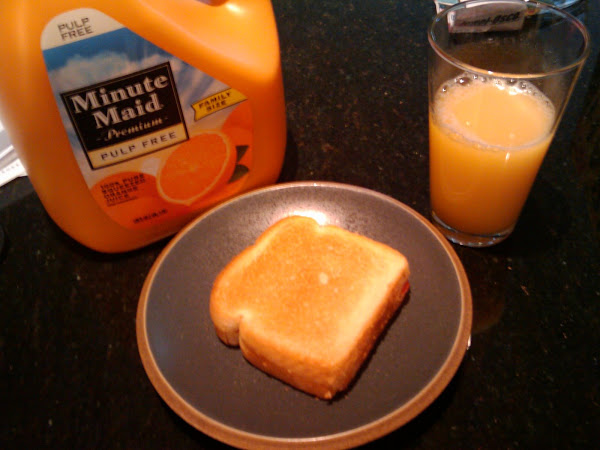
This morning I had a peanut butter and jelly sandwich, toasted. It was delicious. Along with it I had some orange juice (OJ), but not just any OJ, Minute Maid OJ.
For years I’ve been more of a Tropicana OJ kind-of-guy, but with Tropicana’s somewhat recent logo switch on their cartons, I just felt compelled to switch.
The reason? I just don’t get why they changed their logo.
What they had before made sense (see left carton). An orange with a straw in it. Simple and refreshing. And don’t think I didn’t notice the green leaf that’s still attached to it. If that doesn’t convey fresh, I don’t know what does.
Their new logo (right carton)… I don’t know what that’s supposed to be. It doesn’t register in my mind as any kind of orange icon or flavor. It’s generic and boring looking.
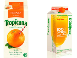
I like my OJ pulp-free. Notice how Tropicana’s old logo, the text of “No Pulp” is easy to find, top and middle. Look at Minute Maid’s logo, “Pulp Free” is right under it! Both so simple!
When looking at Tropicana’s new design, I see their logo running sideways on the right with a lot of white space on the bottom right, not to mention an orange curve running up the left of the carton. “Pulp Free” is located in small text on the top left. My eye is not drawn to it at all.
If I can’t easily find out if it’s pulp-free or not, why would I spend time looking through a poorly designed carton of orange juice? Hence my switch to Minute Maid.